Digital Aid Seattle
Interactive impact map for donor transparency
Industry
Nonprofit, Gaming, Charity
Duration
1 year
Role
Lead UX/UI designer
Skills
Visual design
Context
Who is Games for Love?
Games For Love is a non-profit gaming charity organization who’s mission is to create sustainable futures for children through technology.
Challenge
All donations for Games For Love go to a general fund, hence donors have no idea when and where their donation money is deployed.
Funding requests from specific hospitals are invisible to donors as well. Games For Love staff use an internal dashboard to track impacts. But external partners/ brands do not have access to that information, affecting Games For Love marketing efforts as well.
Solution
What did we do?
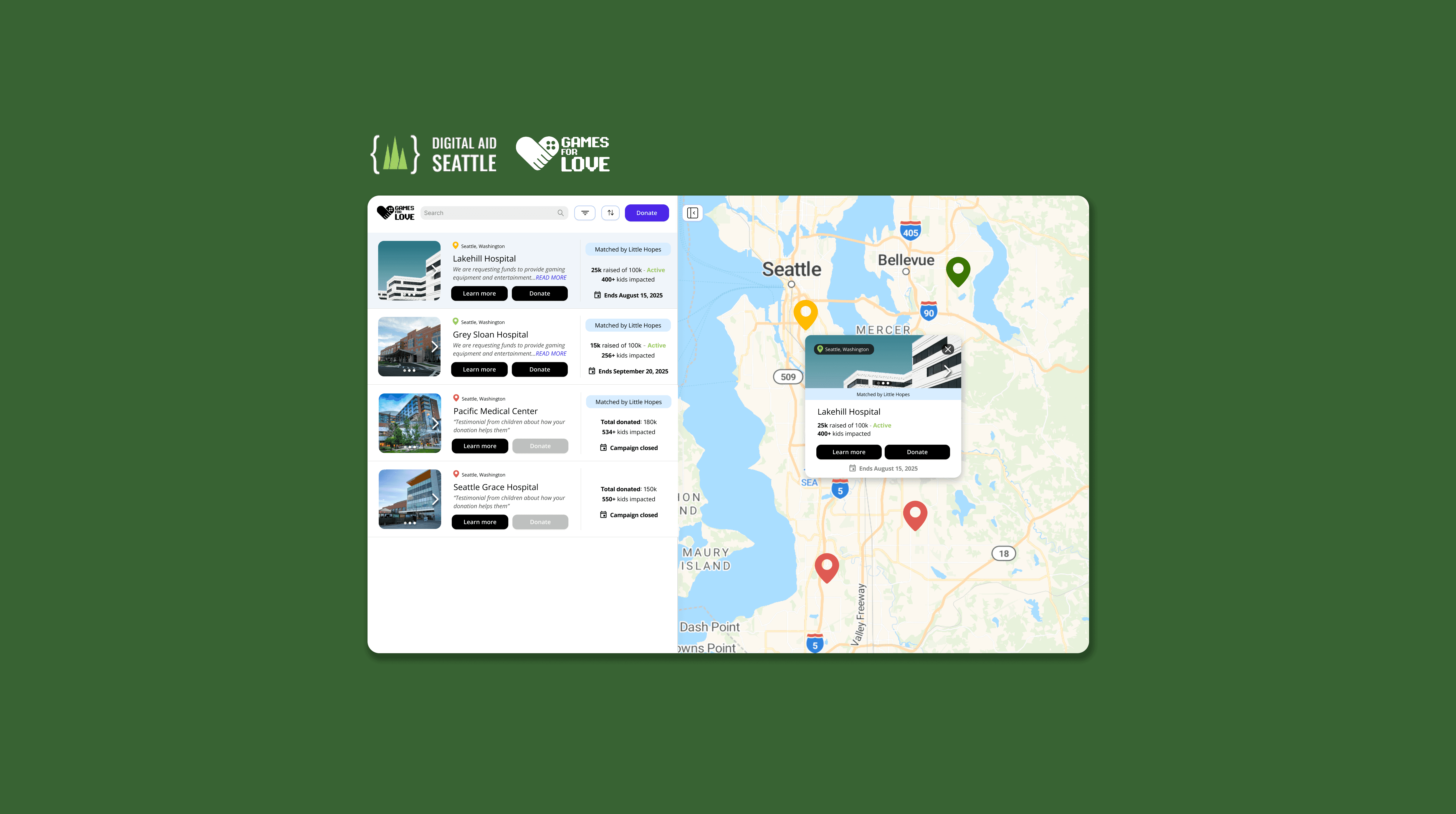
In an effort to increase donations and enhance transparency regarding these contributions, GFL partnered with Digital Aid Seattle (DAS) to develop a visualization map. This map will illustrate the total amount of donations collected to date and provide clear insights into how these funds are allocated. In collaboration with a team of developers, QAs and a researcher, the primary goal of the project was to drive transparency in funding progress, with a secondary goal of increasing donations.
We constructed a web application using GFL Airtable as the data source. GFL would be able to deploy a web application within their infrastructure, then embed it within the donor section of their website.
Impact
My role
... as the lead UX/UI designer from 0 → 1
I was responsible for collaborating with stakeholders and developers to create the visual design of the asset including creating a design system, components, and an optimized responsive design for mobile using Figma.
Initial research & assumptions
According to previous research, some pain paints of the client included:
Fragmented donor experience. GFL offers multiple ways to donate, but without a clear pathway tailored to different donor types, contributions remain scattered and difficult to optimize.
Charity streams drive the majority of donations. This reveals a significant dependency on a single channel, and an opportunity to capture donor intent in a more structured way.
Weak feedback loops between GFL and its donors. Donor engagement is spread across Discord, social media, email campaigns, and in-person events, but none of these channels work together to create a cohesive relationship with the people donating.
The current experience does not support returning donors. There is no meaningful mechanism to re-engage past contributors, acknowledge their history with GFL, or show them the progress their donations have made.
Based on these insights, we can assume that...
Transparency drives donor trust and repeat donations. If donors can see exactly where their money goes and track its impact over time, they are more likely to give again. The current lack of visibility into fund allocation is actively limiting donor retention.
Donors are most motivated to give when they feel a personal connection to a cause. Because most donations happen during charity streams, giving is often tied to an emotional moment rather than a deliberate decision. By making it easier to donate to a specific hospital or location, we can convert impulse giving into more intentional, recurring support.
A unified, engaging experience can reduce dependency on a single channel. GFL's donor touchpoints are fragmented across platforms with no central hub tying them together. Bringing funding progress, impact stories, and donation actions into one interactive experience could strengthen engagement across channels and reduce reliance on charity streams as the primary driver of contributions.
Design question
How might we design an interactive donation map that makes GFL's funding visible and trustworthy, while creating an experience engaging enough to motivate donors to give again?
Design goals
Ideation
Based on the initial research and design goals, I created a lo-fi wireframe that supported the immediate design goals
The client also suggested building a hospital landing page in addition to the map, that would allow for users to access more information regarding the request narrative, impact, and donation status,

Design solution
After countless iterations and feedback from the client, I was able to create the final screens and design system for GFL. I used Lovable to ideate on the design inspiration and layout.
When presenting the initial wireframe to the client, they emphasized that the screens should be playful and engaging.

Design decisions
Design decision .01
Multiple donation entry points
Each location on the map should have a donation action tied to it, so donors can give to a specific place rather than a general fund. This supports the assumption that personal connection drives more intentional giving.

Design decision .02
Visibility of fund allocation via impact numbers
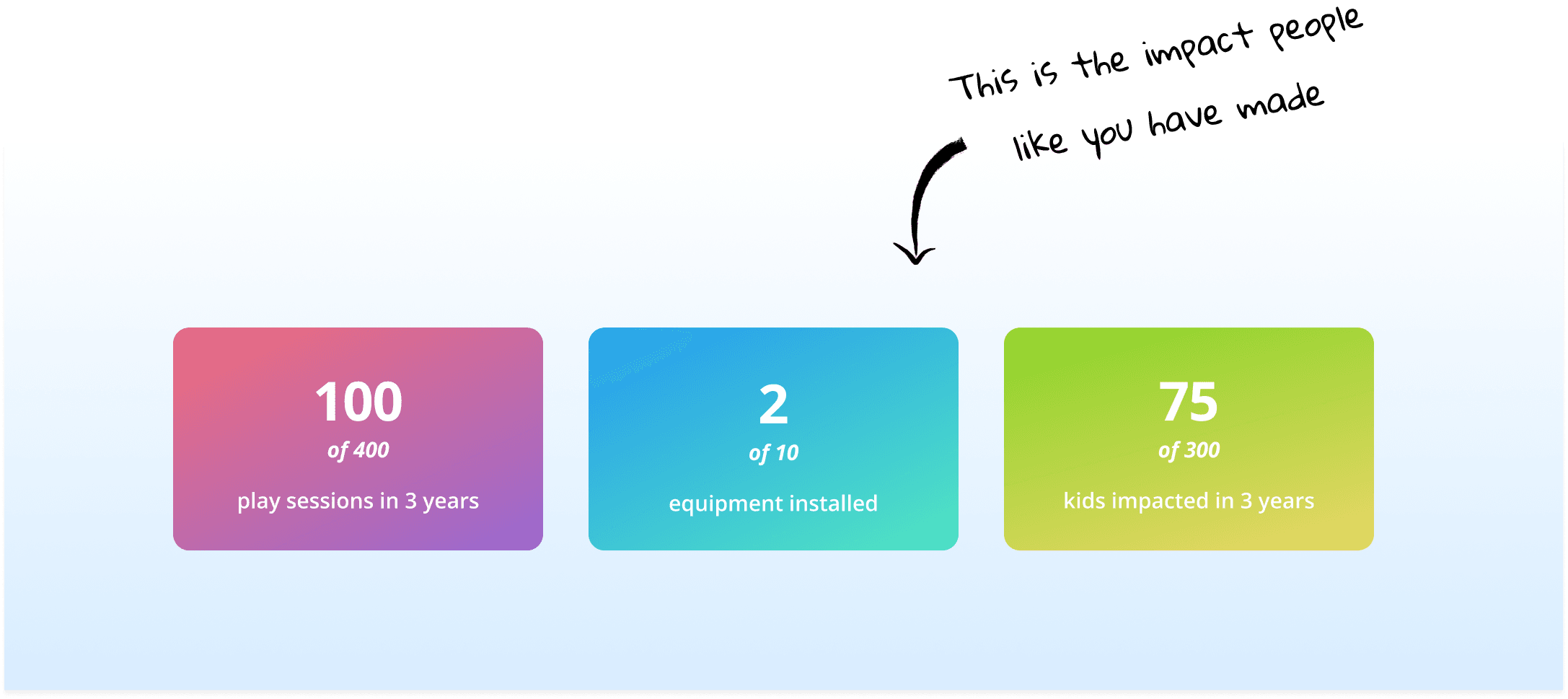
The map should clearly show where donations are going in real time — including specific hospitals, funding progress, and how close each location is to meeting its goal. This directly addresses the transparency gap that is limiting donor trust and retention.
Design decision .03
Progress tracking over time
The prototype should communicate funding milestones and growth in a way that rewards returning donors with something new to see. This creates the feedback loop that GFL currently lacks and gives donors a reason to come back.

Design decision .04
Shareable marketing asset
Because external partners and brands currently have no visibility into GFL's impact data, the map should be designed in a way that feels credible and compelling enough to use as a marketing asset — not just an internal reporting tool.
Reflection
Key learnings
Collaborating with developers and stakeholders early was essential. Getting aligned on scope and feasibility from the start prevented bigger misalignments down the line.
As the sole UX designer on the team, I quickly learned that good design work is only half the job. Advocating for user-centered decisions and accessibility standards in a cross-functional environment meant learning how to communicate the value of design to people with very different priorities.
If I did this again…
I would integrate AI tools earlier in the ideation process to move faster through initial concepts and spend more time refining what matters.
I would also prioritize formal usability testing to identify friction points in the experience that are easy to miss without direct user feedback.